Featured Project
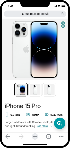
EE Business Shop
Optimised mobile commerce through strategic UX research, A/B testing, and interface redesign — achieving 59% higher conversion rates.
Optimised mobile commerce through strategic UX research, A/B testing, and interface redesign — achieving 59% higher conversion rates.
 Figma
Figma
 UserTesting


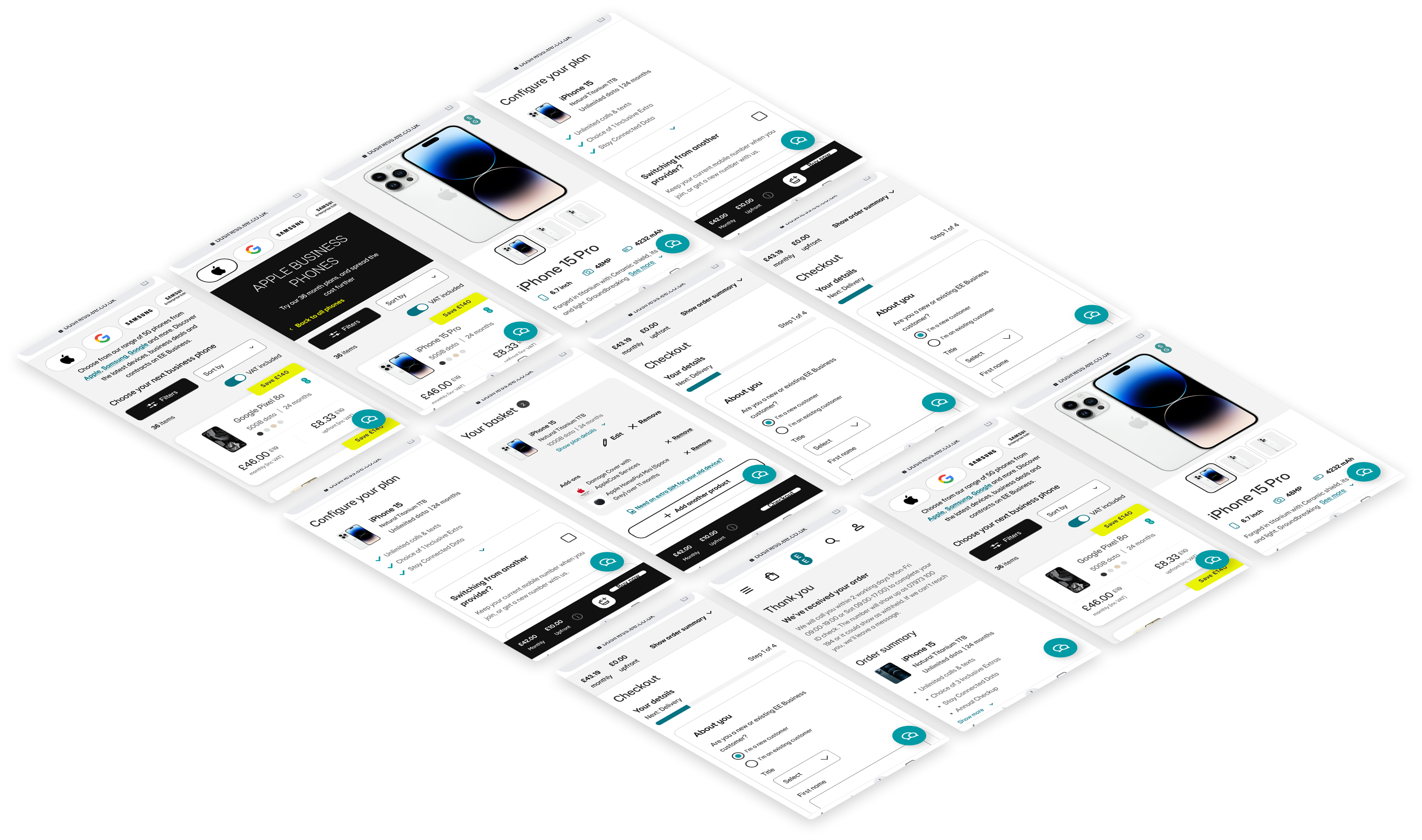
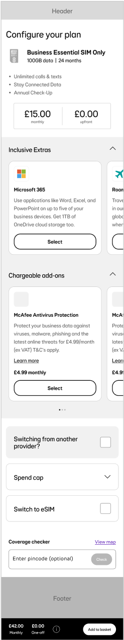
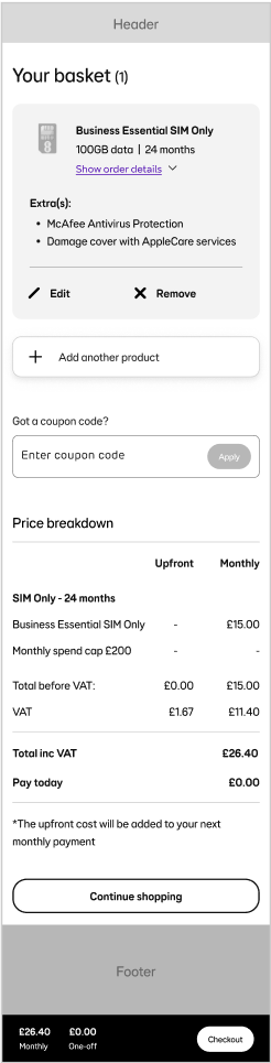
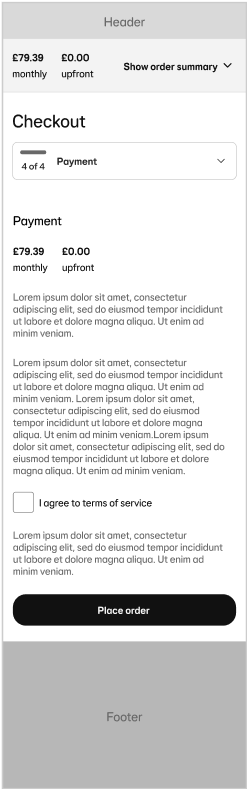
The EE Business Shop was to undergo a migration from its legacy CMS to a custom CMS, for strategic reasons. During this time, as a product design team we had a limited time-window to conduct and extract existing research to produce a new optimised journey that would lead to improved order conversion. This involved an intensive process of discovery, ideation and testing with strategic thinking in order to execute an improved journey in such a limited timeframe.
I began discovery by analysing the existing EE Business Shop analytics to understand how users were moving through the purchase journey across devices. The data showed a clear mismatch: mobile accounted for a significant proportion of traffic, but conversion rates were materially lower than desktop.
This reframed the problem. Rather than treating the project as a general visual redesign, I identified mobile conversion as a key opportunity area. My next step was to investigate where the mobile journey was creating friction, so that design decisions could be tied directly to improving purchase confidence and reducing drop-off.
To understand why mobile conversion was underperforming, I reviewed existing analytics, conducted user interviews, tested the live site with users, and audited the current product journey. This helped surface three recurring barriers that were making it harder for business customers to compare options, find the right plan, and move confidently towards checkout.
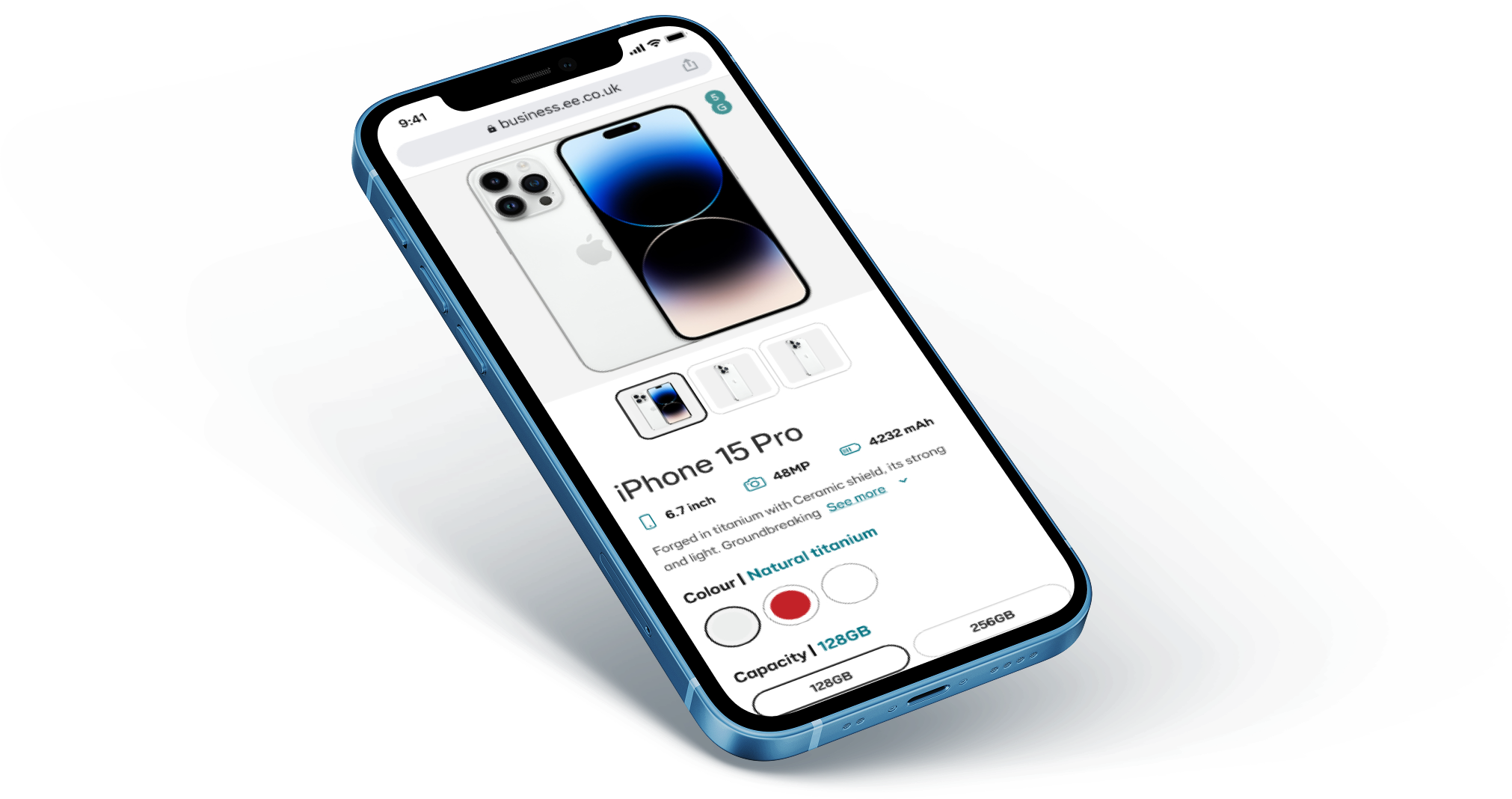
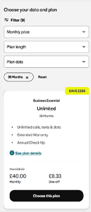
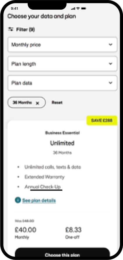
Users struggled to compare plans side-by-side, especially when key differences were spread across long product pages. This made it harder to understand value, compare options, and choose a plan with confidence.
Product pages required excessive scrolling, particularly on mobile. Important information was buried across the page, increasing effort for users and creating more opportunities for drop-off before checkout.
Users could not filter plans with enough granularity, particularly around data allowances. This forced them to manually scan irrelevant options, slowing down decision-making and making the journey feel less tailored to their needs.
Facilitating a UX workshop which combined design and non-design stakeholders (Product Owner, Business Analyst, Marketing). During this session we compiled the analytics, user research insights and brought everyone together to define the main problems we wanted to solve and bring into the migration/optimisation with a mobile-centric mindset. As a group we then voted on the best features and the most popular ones were considered for design.
Rapid prototyping to explore multiple solutions, focusing on mobile-first filtering and product comparison. This enabled me to be proactive by feasibility reviewing the mid-fidelity design without wasting time on finer details such as colouring and theming. This also helped establish which components were readily available in our component library and which would need to be developed as custom.
Testing dropdown filters vs. chip filters to determine which interface drove better engagement and conversion. With support from the Conversion Rate Optimisation (CRO) team we were able to run 2 A/B tests with the differing functionality. We were then able to compare and contrast the funnel data and order conversion to establish which approach would be better.
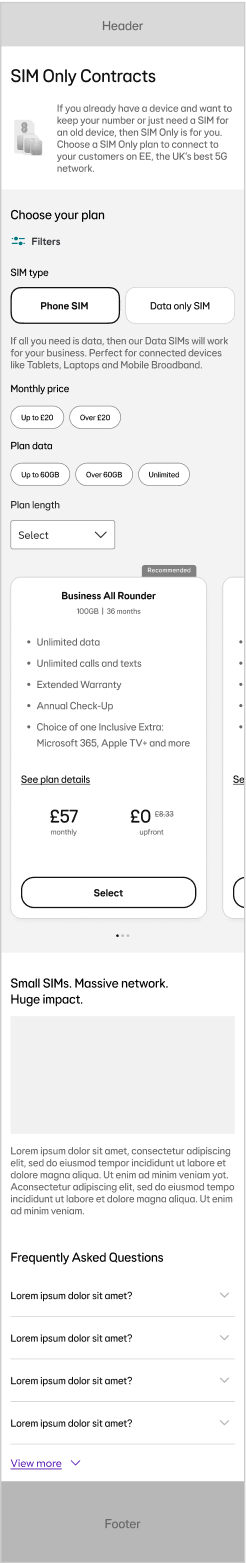
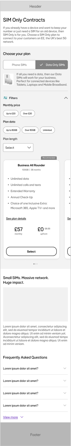
One of the clearest opportunities from discovery was to reduce the effort required for users to find the right plan. On mobile, the existing dropdown filters added unnecessary interaction cost and made important plan criteria less visible at the point of decision.


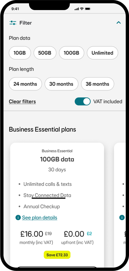
I partnered with the CRO team to shape and test alternative filtering approaches, including a chip-filter variant that brought key refinement options into the main product browsing journey. This allowed us to test whether making filters more visible would improve plan discovery and support conversion.
After the migrated journey launched, we tracked order conversion over a two-month period to understand whether the redesigned experience was improving performance against the previous site.
While the CMS migration created the opportunity to rebuild the journey, the uplift suggested that the UX improvements — including clearer filtering, easier plan comparison, and a more streamlined mobile experience — helped reduce friction at key decision points.